
The other day, it occurred to me that I might need an oil change. I looked at the little sticker in the corner of my windshield, then I looked at the mileage of the vehicle. My mind was put at ease, quickly and certainly.
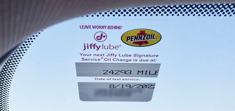
Somewhere along the way, the automotive industry figured out that it’s not useful for people to know the number of miles at which they need their next oil change UNLESS they also know their current mileage.
The little windshield sticker, presented right there in the context of your current mileage, vastly increase the likelihood that you’re going to swing by the shop for an oil change when the time is right.
What else do users need for this info to be actionable?
Product design often involves surfacing information that people want. But when we provide information, we need to ask ourselves (and our users), what else do you need in order for this information to be actionable?
Without proper context, we’re expecting users to take the information and piece it together themselves. This eats up needless time and energy, and increases the odds that they’ll either procrastinate on the whole thing, or reach the wrong conclusion.
Usability testing and expert review can help you root out places in your user experience where information is adding noise rather than guidance.
Consider whether the information you’re presenting includes enough context to make it actionable.
Otherwise, it's just noise.